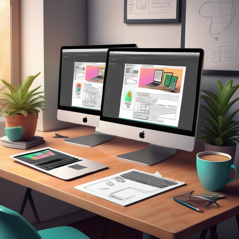
Responsive web design is a crucial aspect of creating modern websites that adapt to various screen sizes. There are four primary types of responsive web design techniques commonly used today:
1. **Fluid Grid Layout:** This method involves designing a website layout using proportional units like percentages rather than fixed units like pixels. The elements on the webpage adjust smoothly as the screen size changes.
2. **Media Queries:** Media queries allow developers to apply specific CSS styles based on factors like screen width, resolution, and orientation. This technique enables targeted adjustments for different devices.
3. **Flexible Images and Media:** By using CSS properties such as ‘max-width: 100%’, images and media can scale down proportionally to fit smaller screens without losing quality or breaking the layout. This ensures a seamless visual experience across devices.
4. **Viewport Units:** Viewport units like vw (viewport width) and vh (viewport height) allow developers to size elements relative to the viewport dimensions. This technique helps in creating designs that are responsive not just to different screen sizes but also to varying viewport sizes within a single device, such as when a user changes orientation from portrait to landscape mode.
Mastering these different types of responsive web design techniques empowers
Key Highlights
- Responsive web design is crucial for providing a seamless user experience across different devices and screen sizes.
- It involves creating flexible layouts and images that adapt to the user’s device and screen size.
- Media queries and CSS styles play a key role in implementing responsive web design.
- The use of fluid grids, flexible images, and media queries are essential for achieving responsive layouts.
- Frameworks like Bootstrap provide a convenient way to create responsive websites.
- Designing for the future involves incorporating mobile-first design principles and keeping up with emerging technologies.
Introduction
Responsive web design has become an essential aspect of modern web development. With the increasing use of mobile devices and varying screen sizes, websites must be able to adapt to different devices and provide a seamless user experience. Responsive web design allows websites to respond and adjust their layout, content, and functionality based on the user’s device and screen size.
Gone are the days when websites were designed with fixed layouts that only catered to desktop screens. Today, users access websites on a wide range of devices, including smartphones, tablets, laptops, and desktop computers. Each of these devices has its own unique screen size and resolution, and responsive web design ensures that websites are optimized for all of them.
Responsive web design focuses on creating flexible layouts and images that can adapt to different screen sizes. This is achieved through the use of media queries, which allow the website to apply different CSS styles based on the characteristics of the user’s device. By using relative units and percentages instead of fixed pixels, elements on the website can resize and reposition themselves to fit the available screen space.
In this blog, we will explore the different types of responsive web design and how they can be implemented. We will also discuss the significance of media queries, frameworks and tools for responsive design, trends in responsive design, and common challenges faced in responsive web design. So let’s dive in and master the art of responsive web design!
Understanding Responsive Web Design
To understand responsive web design, it is important to first grasp the concept of web design itself. Web design involves creating the visual elements and layout of a website, including colors, typography, graphics, and overall user interface. The goal of web design is to create an engaging and user-friendly experience for website visitors.
Responsive web design takes web design a step further by ensuring that the website’s layout and content adapt to the user’s device and screen size. It focuses on creating a seamless user experience across different platforms and devices.
Responsive web design considers factors such as screen size, resolution, and device capabilities to provide an optimal viewing experience. Whether the user is accessing the website on a smartphone, tablet, laptop, or desktop computer, the website will automatically adjust its layout and content to fit the screen.
The primary goal of responsive web design is to enhance user experience. By providing a consistent and visually appealing experience across different devices, users are more likely to engage with the website and stay longer. Responsive web design also improves accessibility as users can easily navigate and interact with the website regardless of the device they are using.
In addition to improving user experience, responsive web design also has SEO benefits. Search engines like Google prioritize mobile-friendly websites in their search results, meaning that responsive websites are more likely to rank higher. This can lead to increased visibility and traffic for the website.
Overall, responsive web design is a fundamental aspect of modern web development. By prioritizing user experience and adapting to different devices, websites can effectively reach and engage with their target audience. www.lowcostdigital.ie
Defining Responsive Web Design and Its Importance
Responsive web design can be defined as an approach to web design that aims to create websites that adapt and respond to different devices and screen sizes. It involves using flexible layouts, fluid grids, and media queries to ensure that the website looks and functions optimally on any device.
The importance of responsive web design cannot be overstated. With the increasing use of smartphones and tablets, it is crucial for websites to be accessible and user-friendly on all devices. A responsive website ensures that the layout and content adjust seamlessly to fit the screen size, providing a consistent and engaging user experience.
By implementing responsive design, websites can cater to a wider audience and reach users who access the internet on mobile devices. This can lead to increased user engagement, longer time spent on the website, and higher conversion rates.
Responsive web design also simplifies website maintenance and development. Instead of creating separate versions of a website for different devices, a responsive website allows for a single design and codebase that can adapt to any screen size. This saves time, effort, and resources, making it a cost-effective solution for businesses.
In conclusion, responsive web design is essential for creating websites that provide a seamless user experience across different devices. By adapting to various screen sizes and catering to the needs of mobile users, responsive websites can enhance user engagement, improve SEO performance, and simplify website development and maintenance. www.lowcostdigital.ie
Key Takeaways on Responsive Web Design
In summary, here are the key takeaways on responsive web design:
- Responsive web design is crucial for providing a seamless user experience across different devices and screen sizes.
- It involves creating flexible layouts and images that adapt to the user’s device and screen size.
- Media queries and CSS styles play a key role in implementing responsive web design.
- By using fluid grids, flexible images, and media queries, websites can achieve responsive layouts that adjust to different screen sizes.
- Responsive web design improves user experience by providing a consistent and visually appealing experience on all devices.
- It also has SEO benefits, as search engines prioritize mobile-friendly websites.
- Responsive web design simplifies website development and maintenance by allowing for a single design that adapts to any screen size.
- Overall, responsive web design is essential for creating websites that engage users, improve SEO performance, and cater to the needs of mobile users.
By mastering the different types of responsive web design, web designers can create websites that provide an optimal user experience across all devices and screen sizes. www.lowcostdigital.ie
Exploring Types of Responsive Web Design
Responsive web design encompasses various techniques and approaches to adapt websites to different devices. Let’s explore the different types of responsive web design:
- Fluid Layout: A fluid layout uses relative units like percentages to ensure that the website’s elements resize proportionally based on the screen width. This allows for a more flexible and adaptive design.
- Flexible Images: Responsive web design includes techniques like flexible images, which automatically scale and adjust based on the screen size. This ensures that images maintain their aspect ratio and don’t break the layout.
- Media Queries: Media queries are a fundamental part of responsive web design. They allow websites to apply different styles and layouts based on the screen size and other device capabilities.
Fluid Grids: The Foundation of Flexibility
One of the key elements of responsive web design is the use of fluid grids. A fluid grid is a layout that adjusts proportionally to fit different screen sizes. This is achieved by using relative units, such as percentages, instead of fixed pixel values.
By using relative units, a fluid grid can adapt to different screen widths, ensuring that the website’s layout remains consistent and visually appealing across devices. For example, a fluid grid might have three equal-width columns on a desktop screen, but stack vertically on a smaller screen like a smartphone.
The fluid grid concept allows for a more flexible and adaptable design, as it eliminates the need for fixed-width layouts that may not fit all screen sizes. Instead, the layout adjusts automatically to provide an optimal user experience on any device. www.lowcostdigital.ie
Flexible Images and Media: Scaling for Every Device
In responsive web design, it’s essential to ensure that images and media elements adapt to different screen sizes. Flexible images and media are key to achieving this.
Flexible images are images that can scale and adjust based on the available space on the screen. This prevents images from breaking the layout or appearing too large or too small on different devices. By using CSS techniques like max-width: 100%, images can automatically resize to fit the container without distorting their aspect ratio.
Responsive images take the concept of flexible images a step further. They use HTML and CSS to provide different image sources based on the screen size and resolution. This helps optimize the website’s performance by delivering appropriately sized images to each device, ensuring fast loading times and a better user experience.
By implementing flexible images and responsive images, websites can ensure that their visual content looks great on all devices, from large desktop screens to small smartphone displays. www.lowcostdigital.ie
Implementing CSS and HTML in Responsive Design
CSS and HTML play crucial roles in implementing responsive design techniques. Let’s explore how they contribute to creating responsive websites:
- CSS Media Queries: Media queries allow websites to apply different styles and layouts based on the screen size and other device characteristics. By using CSS media queries, developers can define specific rules for different breakpoints and adjust the website’s design accordingly.
- HTML: HTML provides the structure and content of a webpage. By using semantic HTML elements, developers can ensure that the website’s structure is accessible and easily adaptable to different screen sizes.
- CSS Styles: CSS styles define the visual appearance of a webpage. In responsive design, CSS styles are used to create flexible layouts, adjust font sizes, and optimize the overall user experience across different devices.
Role of CSS3 in Creating Dynamic Layouts
CSS3 introduces powerful features that enable web designers to create dynamic layouts in responsive web design. Here’s the role of CSS3 in creating dynamic layouts:
- CSS Media Queries: CSS3 includes media queries, which allow developers to define specific styles based on the screen size, resolution, and other device capabilities. Media queries are the backbone of responsive design as they enable dynamic adaptation of layouts for different devices.
- Layout Elements: CSS3 introduces several layout elements such as Flexbox and Grid Layout. These layout models provide more control over how content is arranged and positioned on the webpage. They allow for responsive designs that adapt to different screen widths and orientations.
- Screen Width: CSS3 enables developers to set rules based on the screen width, ensuring that the layout adjusts dynamically to provide an optimal user experience. This allows websites to be accessible and visually appealing on a wide range of devices and screen sizes. www.lowcostdigital.ie
HTML5’s Contribution to Responsive Structures
HTML5, the latest version of the HTML standard, introduces several features that contribute to creating responsive website structures. Let’s explore HTML5’s contribution to responsive structures:
- Semantic HTML: HTML5 introduces new semantic elements like
<header>,<nav>,<main>, and<footer>. These elements provide clearer structure and improve accessibility. Properly using these semantic elements helps create a responsive layout that adapts to different devices. - Responsive Images: HTML5 introduces the
<picture>and<srcset>elements, which allow developers to provide different image sources for different screen sizes. By using these elements, websites can deliver appropriately sized images, improving performance and user experience. - Flexible Layouts: HTML5 provides enhanced support for creating flexible layouts. With features like new form input types and the
<details>and<summary>elements, developers can create more interactive and responsive user interfaces.
The Significance of Media Queries
Media queries are a critical component of responsive web design. Let’s explore the significance of media queries:
- Media queries allow websites to adapt their styles and layouts based on the user’s device and screen size.
- By using media queries, developers can create responsive designs that provide an optimal user experience across different devices, from desktop computers to smartphones.
- Media queries enable websites to adjust font sizes, rearrange content, and optimize the layout to fit the available screen space.
- With media queries, websites can ensure that their content remains accessible and readable, regardless of the user’s screen size or browser window. www.lowcostdigital.ie
Customizing Content Presentation Across Devices
Responsive web design allows developers to customize the presentation of content based on the user’s device. Here’s how media queries enable customizing content presentation across devices:
- With media queries, developers can define different rules for different screen sizes, allowing for a tailored user experience on various devices.
- Media queries can be used to adjust font sizes, reposition elements, and modify the overall layout to ensure that content is easily readable and accessible on screens of all sizes.
- By customizing content presentation, responsive web design enhances the user experience, making it easier for users to navigate, read, and interact with the website on any device.
- Customizing content presentation across devices is essential for creating a seamless and engaging user experience, regardless of whether users are accessing the website from a desktop, tablet, or smartphone.
Examples of Media Query Usage
Media queries are a powerful tool in responsive web design. Here are some examples of how media queries are used to customize website layouts based on different screen widths:
|
Screen Width |
CSS Rules Applied |
|
320px |
Adjust font size, stack columns vertically |
|
480px |
Increase padding and margins, hide sidebar |
|
768px |
Increase width of main content, display sidebar |
|
1024px |
Adjust layout for larger screens, increase font size |
These are just a few examples of how media queries can be used to create responsive layouts. By defining specific CSS rules for different breakpoints, developers can ensure that the website’s design adapts to various screen widths, providing a seamless and user-friendly experience. www.lowcostdigital.ie
Frameworks and Tools for Responsive Design
Frameworks and tools can greatly simplify the process of implementing responsive design. Let’s explore some popular options:
- Bootstrap: Bootstrap is a widely-used responsive web design framework that provides pre-built components and a grid system to help developers create responsive layouts quickly.
- Web Developer Tools: Modern web browsers come with built-in developer tools that allow developers to test and debug responsive designs. These tools provide features like device emulation, media query inspection, and responsive design previews.
Using frameworks and tools like Bootstrap and web developer tools can streamline the responsive design process, enhance productivity, and ensure consistent results across different devices.
Bootstrap: A Leading Framework for Responsive Design
Bootstrap is a popular and widely-used framework for responsive web design. Here’s why Bootstrap is a leading choice for creating responsive designs:
- Responsive Website Design: Bootstrap provides a set of predefined CSS and JavaScript components that are designed to be responsive out of the box. This makes it easier for developers to create responsive layouts without writing extensive custom CSS.
- Grid System: Bootstrap’s grid system allows developers to create responsive, grid-based layouts. The grid system provides a flexible and efficient way to arrange and align content across different screen sizes and devices.
- Pre-Built Components: Bootstrap includes a wide range of pre-built components, such as navigation bars, sliders, and modals, that are already optimized for responsiveness. These components can be easily customized and integrated into a responsive design.
By leveraging Bootstrap’s features, developers can save time and effort in creating responsive designs while ensuring a consistent and visually appealing user experience.
Other Essential Tools for Responsive Web Design
Besides Bootstrap, there are several other tools that can help in achieving responsive web design. Here are some essential tools to consider:
- CSS Frameworks: In addition to Bootstrap, there are other CSS frameworks like Foundation and Bulma that provide responsive design capabilities and pre-built components.
- Design Prototyping Tools: Design prototyping tools like Sketch and Adobe XD allow designers to create interactive prototypes of responsive designs, enabling them to test and refine the user experience.
- Programming Languages: HTML, CSS, and JavaScript are the core languages used in web development. Understanding these languages is essential for implementing responsive web design techniques effectively.
- Web Design Testing Tools: Testing tools like BrowserStack and CrossBrowserTesting help ensure that a website appears and functions correctly across different devices, browsers, and platforms.
By utilizing these tools and technologies, web designers and developers can create responsive and visually appealing websites that deliver an optimal user experience across various devices and screen sizes. www.lowcostdigital.ie
Designing for the Future: Trends in Responsive Design
Responsive design continues to evolve as new technologies and trends emerge. Let’s explore some of the key trends in responsive design:
- Mobile-First Design: Mobile-first design is a responsive design approach that prioritizes designing for mobile devices first, then scaling up to larger screens. With the increasing dominance of mobile usage, mobile-first design ensures a better user experience for the majority of users.
- Emerging Technologies: Emerging technologies like virtual reality (VR), augmented reality (AR), and wearable devices present new opportunities and challenges for responsive design. Designers must adapt to these technologies by creating responsive experiences that cater to their unique requirements.
By staying updated on emerging technologies and trends, designers can stay ahead of the curve and deliver innovative and future-proof responsive designs.
The Rise of Mobile-First Design
With the rapid growth of mobile device usage, mobile-first design has become a dominant trend in responsive web design. Here’s why mobile-first design is on the rise:
- Mobile Device Dominance: Mobile devices, such as smartphones and tablets, have become the primary means of accessing the internet for many users. Designing with a mobile-first approach ensures that websites are optimized for the devices that users most commonly use.
- Enhanced User Experience: By focusing on the mobile experience first, designers prioritize the essential content and functionality, ensuring a seamless and intuitive user experience on smaller screens. This approach helps eliminate unnecessary clutter and improves overall usability.
- SEO Benefits: Search engines like Google prioritize mobile-friendly websites in their search results. Adopting a mobile-first design approach can improve a website’s search engine rankings, leading to increased visibility and organic traffic.
Mobile-first design is a strategic approach that allows designers to create responsive websites that meet the needs of today’s mobile-centric users. www.lowcostdigital.ie
Emerging Technologies Shaping Responsive Web Design
Emerging technologies are playing a significant role in shaping the future of responsive web design. Here’s how these technologies are impacting the field:
- Virtual Reality (VR): VR presents new opportunities for immersive web experiences. Responsive design for VR involves creating experiences that adapt to different VR devices and provide a seamless user interface.
- Augmented Reality (AR): AR technologies blend digital content with the real world, creating unique user experiences. Responsive design for AR involves ensuring that AR elements integrate seamlessly with the real-world environment and adapt to different devices.
- Wearable Devices: Wearable devices like smartwatches and fitness trackers require designs that optimize the user experience on small screens. Responsive design for wearables focuses on simplifying content and interactions to fit the limited screen real estate.
By considering the unique requirements of emerging technologies, designers can create responsive web experiences that leverage the full potential of these advancements.
Common Challenges in Responsive Web Design
Responsive web design comes with its own set of challenges. Let’s explore some common challenges in responsive web design:
- Cross-Browser Compatibility: Ensuring consistent performance and appearance across different web browsers can be challenging due to variations in rendering engines and CSS support.
- Performance Optimization: Responsive websites need to load quickly and provide smooth user interactions across devices. Optimizing performance requires minimizing file sizes, leveraging caching techniques, and optimizing code and asset delivery.
- Responsive Images: Delivering appropriately sized images to different devices while maintaining image quality can be a complex task. Responsive image techniques like lazy loading, srcset, and picture elements help address this challenge.
By addressing these challenges, designers can create responsive websites that provide a seamless user experience across a wide range of devices. www.lowcostdigital.ie
Navigating Cross-Browser Compatibility
Cross-browser compatibility is a common challenge in responsive web design. Here’s how to navigate this challenge:
- Test Across Browsers: Test your responsive website across different web browsers, such as Chrome, Firefox, Safari, and Edge, to ensure consistent performance and appearance. Use browser testing tools or services to automate the process.
- Use CSS Resets: CSS resets like Normalize.css help standardize CSS styles across different browsers, reducing the inconsistencies caused by default browser styles.
- Progressive Enhancement: Embrace the principles of progressive enhancement, which involves building a strong foundation that works across all browsers and then layering on more advanced features for modern browsers.
- Graceful Degradation: Implement graceful degradation by providing alternative layouts or functionality for older browsers that may not support certain responsive design features.
By adopting these strategies, you can minimize cross-browser compatibility issues and ensure a consistent experience for all users, regardless of the browser they’re using.
Optimizing Performance for Faster Load Times
Performance optimization is crucial for responsive websites to deliver fast load times and smooth user experiences. Here are some tips for optimizing performance:
- Minify and Compress Files: Minify HTML, CSS, and JavaScript files to reduce their sizes. Compress images using appropriate image compression techniques without compromising quality.
- Enable Caching: Leverage browser caching to store static files on the user’s device, reducing the need to download them with each visit.
- Lazy Loading: Implement lazy loading for images and other non-critical content to defer their loading until they come into view, reducing initial load times.
- Code Optimization: Optimize your code by removing unnecessary scripts and reducing the number of HTTP requests. Use asynchronous loading for scripts and stylesheets whenever possible.
By implementing these performance optimization techniques, you can ensure that your responsive website loads quickly and provides a smooth browsing experience across devices. www.lowcostdigital.ie
Conclusion
In a world where digital presence is paramount, mastering responsive web design is non-negotiable. Understanding the importance of fluid grids, flexible media, CSS, and HTML in creating dynamic layouts is key. Embracing media queries for customized content presentation across devices is crucial. Leveraging frameworks like Bootstrap and staying updated with mobile-first design trends are essential. Despite challenges like cross-browser compatibility, optimizing performance ensures faster load times. Continuous updates and staying abreast of emerging technologies are imperative for staying ahead in responsive web design. Stay tuned for more insights on the evolving landscape of responsive design! www.lowcostdigital.ie
Frequently Asked Questions
What Makes www.lowcostdigital.ie a Go-To for Responsive Web Design?
www.lowcostdigital.ie is a go-to choice for responsive web design because of its expertise in creating websites that deliver a seamless user experience across devices. Their designs are optimized for different screen sizes and layouts, ensuring accessibility and usability on mobile devices.
How Often Should Responsive Designs be Updated?
Responsive designs should be updated regularly to keep up with evolving technologies, user expectations, and design trends. It’s essential to monitor user feedback, analyze website analytics, and stay updated on emerging design best practices to ensure optimal user experience across devices.


