Our Web Development
Services in Ireland
Let the best Ireland Web Development company scale your business
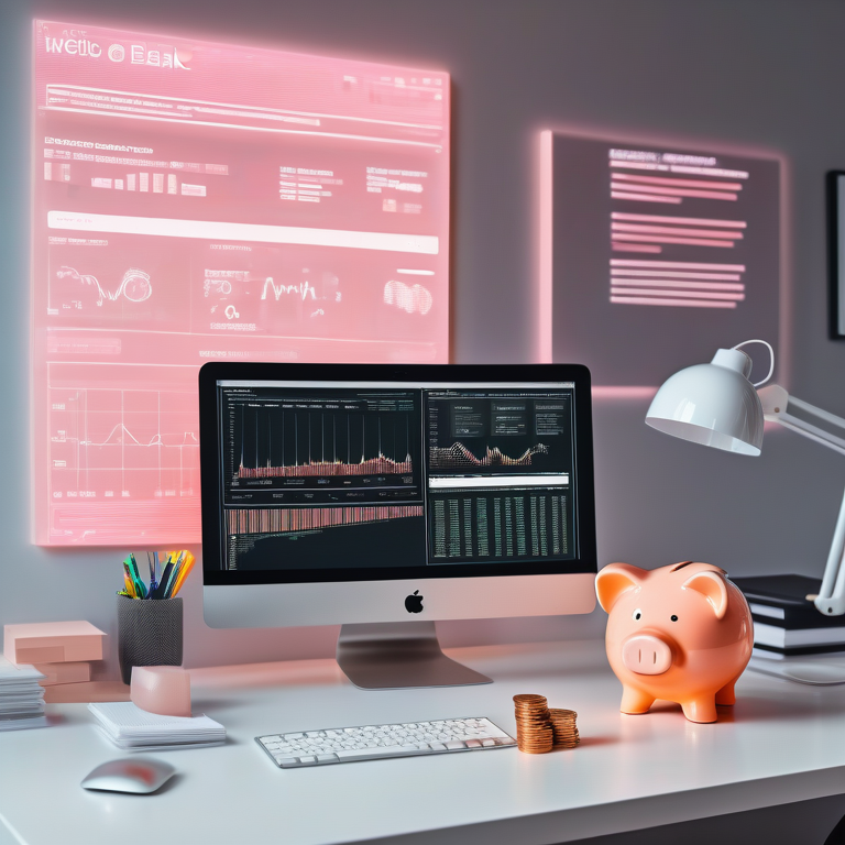
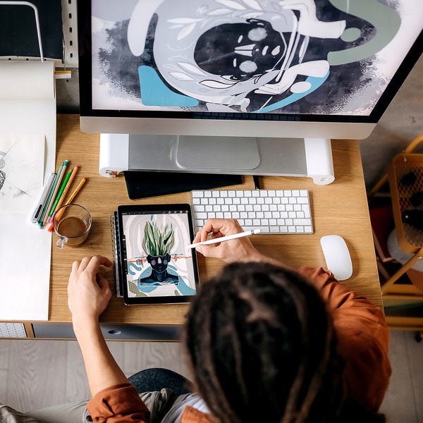
Creative Visual Solutions
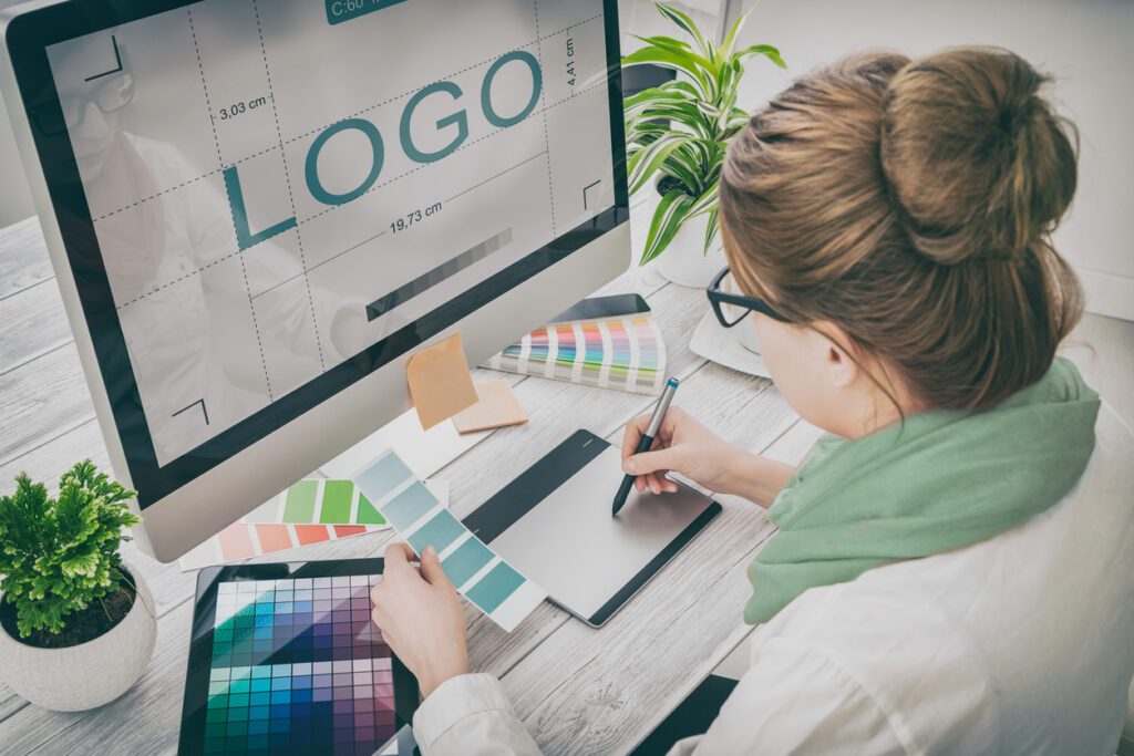
Strong visuals are essential for capturing attention and communicating your brand’s message effectively. Our graphic design services focus on creating eye-catching designs that enhance brand identity and engage your audience.
From logos and social media graphics to marketing materials and packaging, we craft designs that leave a lasting impression. Our team ensures each design aligns with your brand’s vision, maintaining consistency across all platforms.
By blending creativity with strategic design principles, we help businesses build a professional, memorable, and visually compelling presence that drives results.
What our clients say about us
200+ keywords in top rankings-local
4k+ Organic traffic per month
68k+ impressions per month
400+ keywords in top rankings
3k+ Organic traffic per month
250k+ impressions per month
50k impressions per month
100% increase in leads within 3 months
60% organic traffic
100+ keywords in top rankings
8k+ Organic traffic to website
80% Organic traffic in all traffic sources
Enhance Visual Identity
Create stunning, professional designs that align with your brand’s personality and leave a lasting impression on your audience.
Have a Question?
Our Graphic Design Process
Expect a creative and strategic approach to design that enhances brand identity, engages audiences, and delivers impactful visual communication.
Initial Consultation
We discuss your design needs, brand vision, and target audience to establish clear objectives for your project.
Concept Development
Our designers create initial concepts, exploring colour schemes, typography, and layouts to match your brand’s style.
Design Execution
We refine and finalise the selected design, ensuring high-quality visuals tailored to your marketing and branding goals.
Review & Delivery
After revisions and approvals, we deliver print-ready and digital files in various formats for seamless implementation.
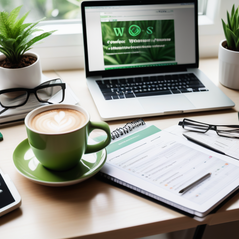
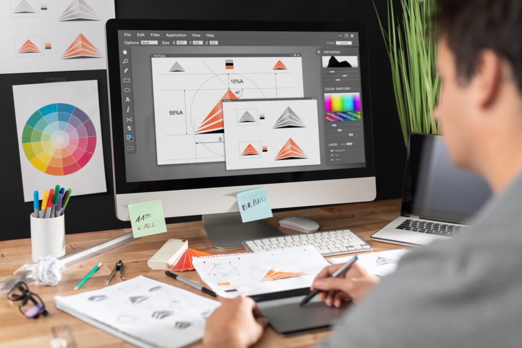
Custom Illustrations
Stand out with bespoke illustrations that add a unique touch to your brand’s visual identity. Whether for websites, social media, or marketing materials, our custom illustrations help you communicate ideas in an engaging and memorable way.
Our team creates detailed, hand-crafted visuals that align with your brand’s personality and messaging. From icons and infographics to character designs and digital artwork, we ensure each illustration enhances your brand’s storytelling.
By combining creativity with strategic design, we craft visuals that not only capture attention but also reinforce brand recognition and engagement across all platforms.
User-Centric Designs
Great design isn’t just about aesthetics—it’s about creating a seamless and engaging experience for your audience. Our user-centric approach ensures that every design element serves a purpose, enhancing clarity and communication.
We focus on intuitive layouts, easy-to-read typography, and visually balanced compositions that guide users naturally. Whether for websites, marketing materials, or branding, our designs are crafted to improve engagement and interaction.
By aligning creativity with functionality, we deliver designs that not only look stunning but also resonate with your audience, strengthening brand recognition and customer connection.
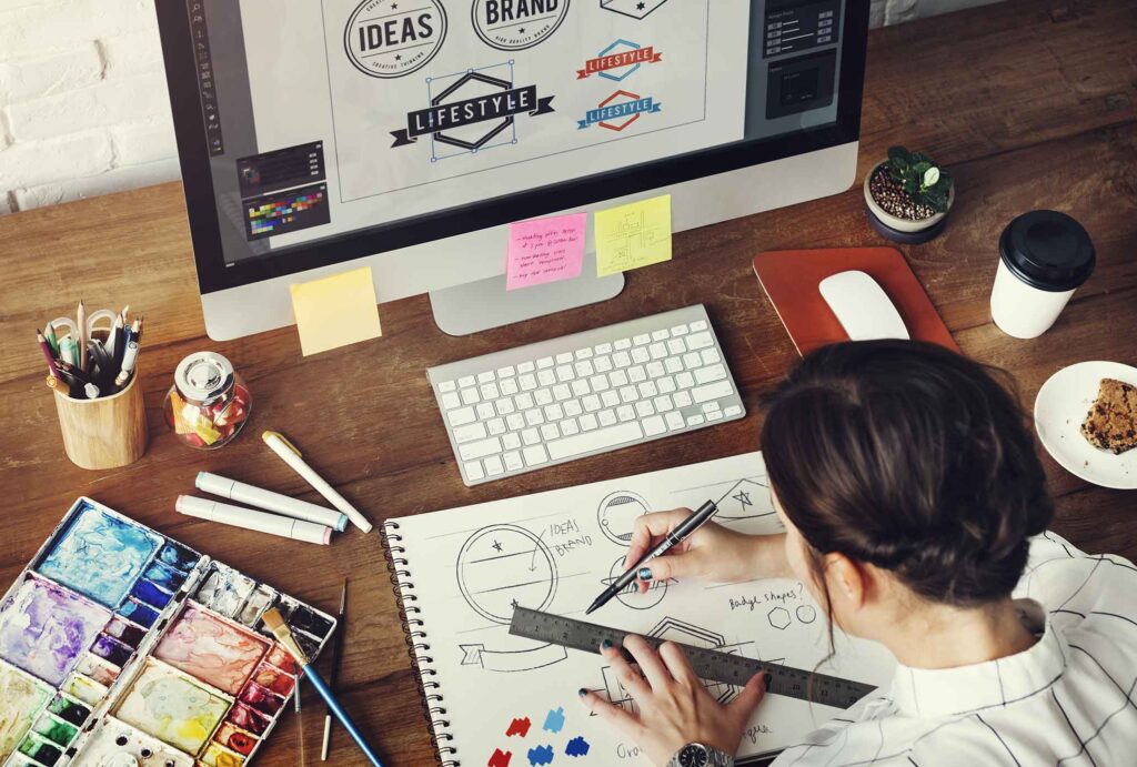
Print & Digital Graphics
We design high-quality visuals for both print and digital platforms, ensuring a cohesive brand presence across all marketing channels. Our creative approach combines eye-catching aesthetics with strategic design principles to deliver graphics that enhance brand recognition and engagement.
From business cards, brochures, and packaging to social media posts, web banners, and presentation materials, our designs are tailored to meet your specific needs. We optimise each asset for clarity, readability, and impact, ensuring that your visuals resonate with your target audience and leave a lasting impression.
With a strong focus on branding consistency, we ensure that your message remains visually compelling and professional across all mediums. We also consider industry trends and user preferences to create graphics that stand out in competitive markets.
Why Choose Low Cost Digital for Graphic Design?
We create visually compelling designs that strengthen brand identity, improve engagement, and drive business growth.
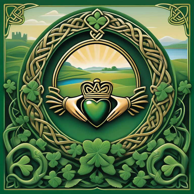
Ireland Graphic Design
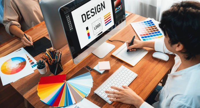
Comprehensive Graphic Design Solutions
We offer complete graphic design solutions that help businesses establish a strong and consistent visual identity. Our team creates designs that are not only visually appealing but also strategically aligned with your brand’s objectives. Whether you need branding materials, social media graphics, or print collateral, we ensure high-quality and impactful designs tailored to your audience.
Our process begins with understanding your brand’s vision, target market, and design preferences. We craft unique logos, brochures, business cards, banners, and more that maintain brand consistency and enhance recognition. For digital platforms, we create engaging social media graphics, website visuals, and marketing assets that drive engagement and conversions.
Every design is optimised for clarity, readability, and impact, ensuring your message is effectively communicated. We prioritise a seamless experience across all formats—whether for web, mobile, or print. With our expertise in combining creativity with functionality, we help businesses build a strong, memorable, and professional brand presence.
Have a Question?
Frequently Asked Questions
What types of graphic design services do you offer?
We provide branding, logo design, marketing materials, social media graphics, website visuals, and print collateral to help businesses create a strong visual identity.
How do you ensure my designs align with my brand?
We begin with a detailed consultation to understand your brand’s vision, target audience, and design preferences, ensuring every visual element reflects your identity.
Can you create designs for both digital and print?
Yes, we design assets for both digital platforms, such as social media and websites, as well as print materials like brochures, business cards, and banners.
Do you offer revisions on the designs?
Yes, we provide revisions based on your feedback to ensure the final design meets your expectations and aligns with your business needs.
What file formats will I receive?
We deliver designs in multiple formats, including JPEG, PNG, PDF, and vector files like AI or EPS, depending on your requirements.
How long does the design process take?
Timelines vary based on project complexity, but we aim to deliver initial concepts within a few days and final designs within a week, depending on revisions.
Can you redesign or refresh my existing brand visuals?
Absolutely! We can update your existing branding to give it a modern, fresh look while maintaining brand consistency and recognition.